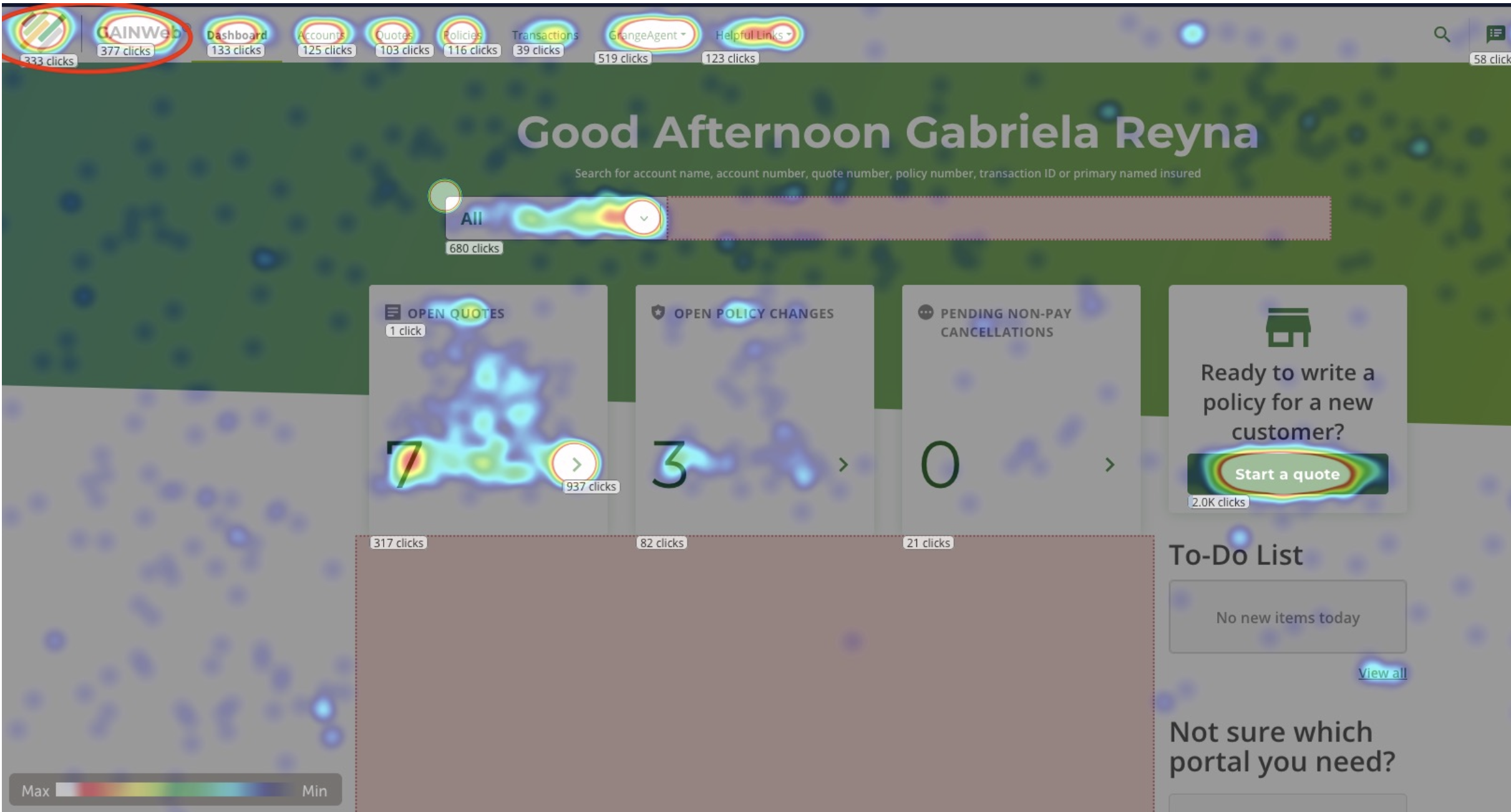
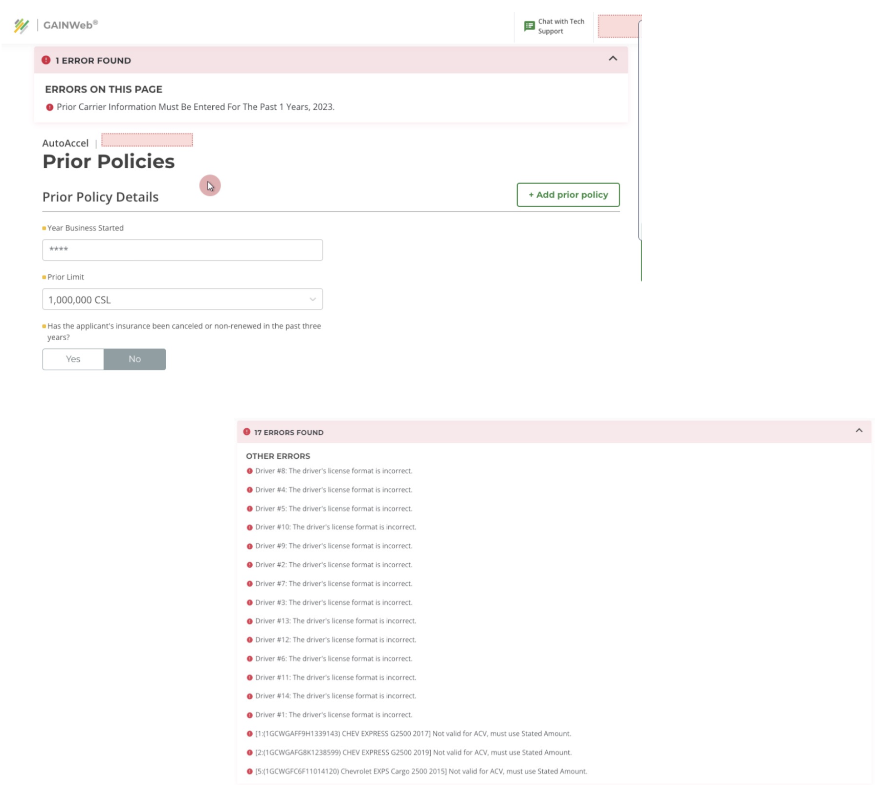
A research-driven evaluation of an agent-facing system to identify usability issues and streamline workflows.
Developed personas to represent user goals and frustrations. Mapped the user journey, identifying pain points such as:
Conducted a lightning demo exercise to analyze competitors like Yelp and Google Maps.
Identified opportunities to merge their best features while addressing gaps:
Designed a high-fidelity prototype focusing on:
Insurance agents rely on an internal quoting platform daily to create and manage complex policies and accounts. Over time, the system had become increasingly cumbersome, leading to slower task completion, recurring errors, and growing user frustration.
My role was to evaluate the current experience, identify key pain points, and deliver actionable insights to support future improvements. These research findings served as the foundation for uncovering design opportunities and informing the next phase of the platform’s evolution.
Developed personas to represent user goals and frustrations. Mapped the user journey, identifying pain points such as:
Conducted a lightning demo exercise to analyze competitors like Yelp and Google Maps.
Identified opportunities to merge their best features while addressing gaps:
Designed a high-fidelity prototype focusing on:
To understand the agent experience with the quoting tool, I began with an audit of real user behavior. I reviewed session recordings, usability feedback, and UI patterns to identify where the experience was breaking down.
Understanding the Agent Experience
This initial research phase helped surface patterns in how users interacted with the platform and where they struggled most. Below are the most critical observations that informed the next phase of analysis.
Key Observations:
After identifying initial friction points, I grouped the findings to better understand recurring themes. I compared areas that worked well against pain points to assess usability gaps and prioritize opportunities.
Identifying Patterns and Priorities
After compiling observations, I categorized what was working well and what needed improvement. This helped prioritize the most critical usability issues.
What worked well:
Pain Points:
With insights from the audit and analysis, I developed targeted recommendations to improve usability. These changes were prioritized based on impact, feasibility, and alignment with user and business needs.
1. Simplify the Layout
Research showed that agents struggled with dense pages and excessive scrolling. Simplifying the layout would help users locate information faster and reduce visual fatigue.
Recommendations:
2. Streamline the Workflow
The quoting flow contained redundant steps and scattered inputs that slowed down task completion. A more streamlined workflow would support efficiency and reduce user frustration.
Recommendations:
3. Reduce Pop-Ups & Add Inline Support
Frequent pop-ups disrupted the user experience and broke focus. Providing contextual support within the interface would allow agents to complete tasks with fewer interruptions.
Recommendations:
This audit revealed critical friction points and laid the foundation for redesigning an internal tool that directly impacts agent productivity. The insights helped guide the product team’s roadmap by prioritizing high-impact changes early.
Next Steps: